It is 2026 and Large Language Models are indispensable for software development.
I’ve long resisted agentic flows, save for Google Jules, which I estimate will be sunsetted about Thursday. It’s a pity, because Jules is great: it works in an isolated environment and hands you a pull request. Code in, diff out.
These days, everyone and their dog uses Claude Code. This is a pity, because it sucks: it’s an unstable, steaming pile of vibe-coded bloat. It’s closed source, though the source code just leaked the other day.
I’ve reluctantly started using Gemini CLI at work so as not to be left too far behind. It’s smaller than Claude Code and also open source, so you can at least have a general idea about what it’s doing.
Still, operational transparency of all of the above is low. I’m old and value simplicity and stability.
Here’s a prediction: despite the name, the coding agent space will be devoured by Pi (website also available at shittycodingagent.ai). Why? Because Mario Zechner showed supremely good taste and made all the right calls:
Mario is a caring individual, not a startup selling out next Monday or going bust on Tuesday. Edit: Mario is now a startup. An Austrian startup with good pedigree, not your usual Silly Valley vultures. Hopefully they don’t mess it up.
Pi is minimalist and conceptually simple.
Pi shows you the number of tokens sent and received per session. Also the current context length. Trivial stuff.
History is a tree, not a list. Branch off wherever you like. Quite an obvious feature.
Model-agnostic. And you can switch models mid-session, because why not?
Self-extending with hot-reload. Ok, fancy!
It runs in YOLO mode. Confirmations are a comfortable lie. Mario says the problem is yet unsolved, but it ain’t rocket science:
the way to avoid destruction is to run the agent in an isolated environment, and
the way to avoid exfiltration is not to give it access to sensitive data.
Mario self-identifies as old to explain his need for simplicity and stability. It clicked for me: I too am old. I predict the simple systems will eventually prevail over the complex ones. The future of code-production is bright, once things settle down and people find out what works and what doesn’t.
I’m afraid I’m all out of tokens for now – good night.
The kid likes mazes. I trawled far and wide, and found the amazing Sean C. Jackson. His mazes are great, we print them, colour them, and even bought his book. But, all the maze apps and websites and everything… they… sort of suck? It feels like no one’s learned anything from Mr Jackson…
I’ve never done anything 3D, this is a recap of my various learnings. A mix of both the aesthetical and the technical aspects. This is a rather long post by my standards, hopefully the images provide some relief.
First, as I’m a newbie, so let’s stick with two shapes: boxes and spheres. Surely boxes and spheres must be enough for everyone? The maze will be made of boxes, what player character could be made of spheres? Yes, a snowman:
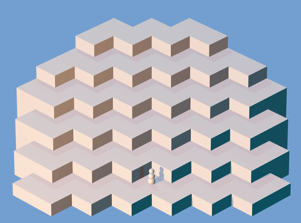
Honestly, I got lucky here. There’s three lights: darker blue from the right, shinier yellow from the left, and a neutral one from the above-behind. I really dig how this picture looked. Unfortunately it had some problems when the maze geometry got more complicated, so I abandoned this approach.
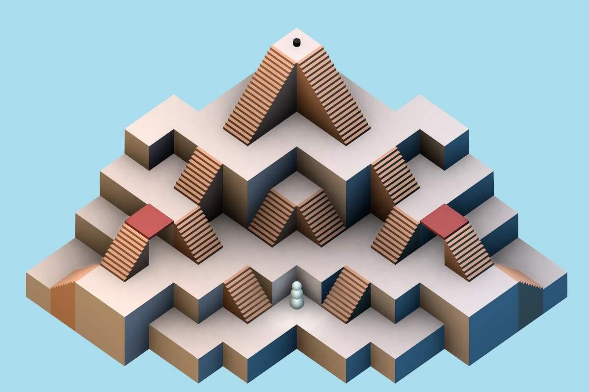
Next I added some stairs and a hat for the snowman to fetch:
There was a misguided attempt at making the maze easier to comprehend and nicer by simulating soft shadows by placing three lights on the left side. As you can see, that didn’t work at all, on multiple levels.
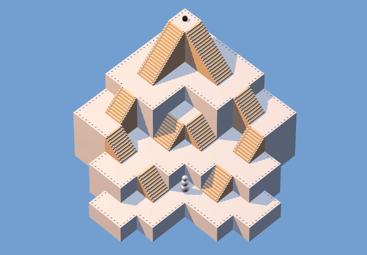
Can you see the little orange spheres in the image above? That’s a maze editor, and we can edit and create mazes. The edited maze is encoded in the url parameters, so it can easily be shared. The above maze is encoded like:
?sz:9,9;off:-3,-3;st:0,0;end:4,4;mz:
x x o2o2o3o3o3o3o3
x x o2z3o3z4z5o5o3
x o1s2o1o3o3o3s5o3
o0o1o1o1z2o2o3s4o3
o0o0s1o1o1s2o3o3o3
x o0o0o0o1o1o1s3o2
x x x o0z1o1z2o2o2
x x x o0o0o1o1x x
x x x x o0o0x x x
If you look from the bottom left side and squint a little, you can see the maze in there: x is nothing, o1 is a regular floor at height one, s, z, S, Z are stairs, and b is a bridge.
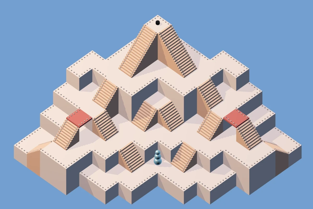
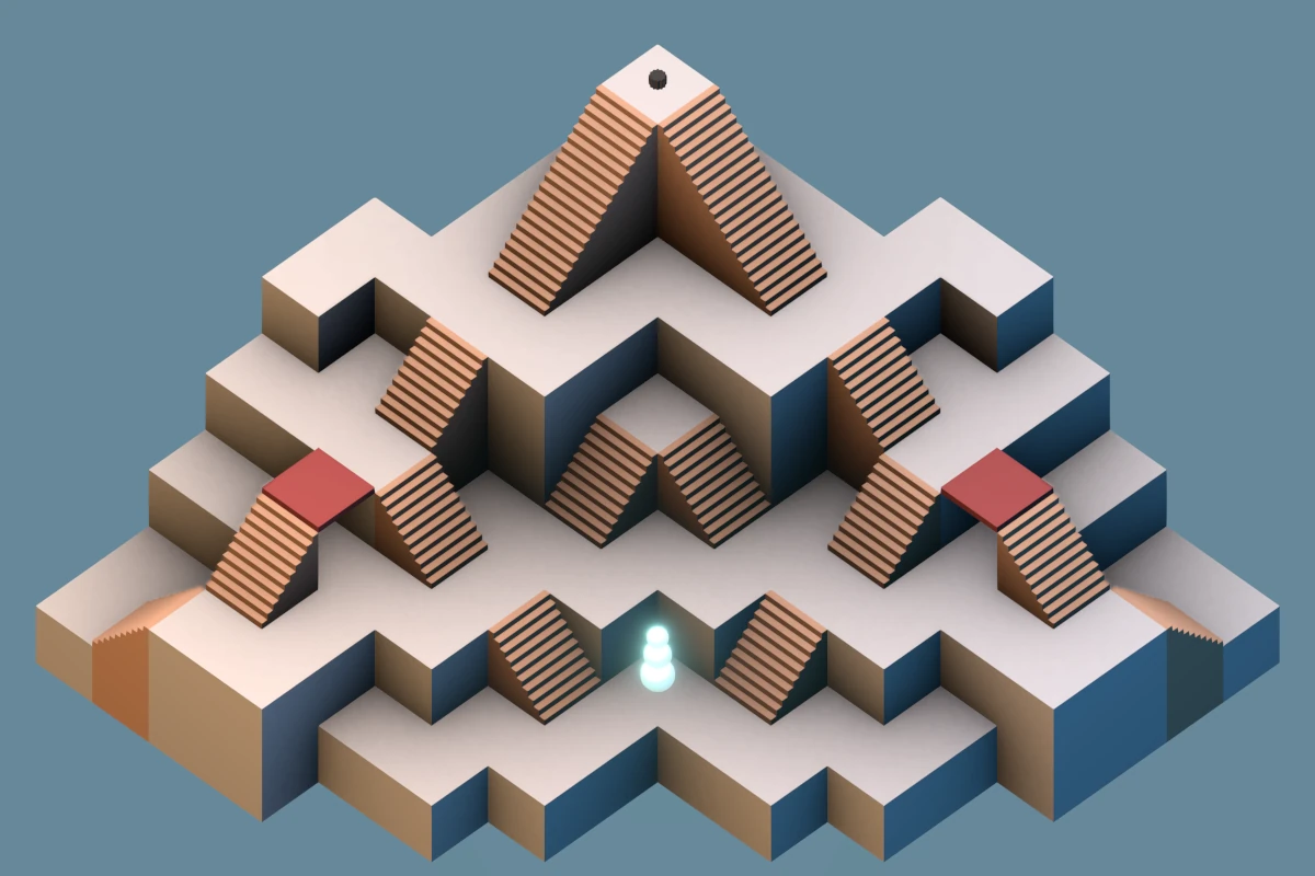
In certain mazes other than the sample maze, it was hard to tell where you can pass and where there’s a drop to a lower floor, so I added some railing to make it clear:
I felt that didn’t look great, but accomplished the goal. I made the shadows a little less pronounced and expanded the sample maze a little, to also show bridges and stairs which lead away from the camera:
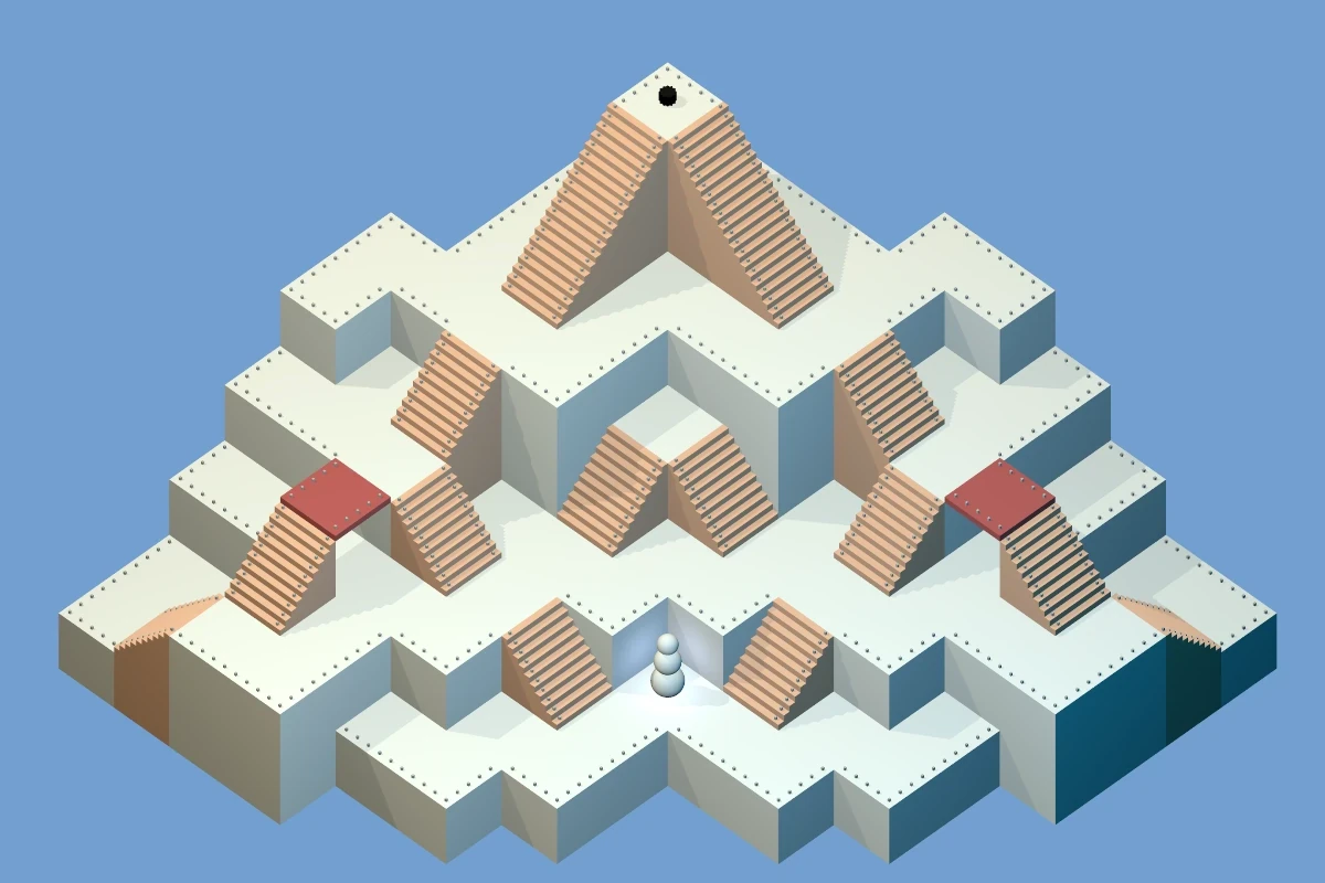
At this point, the whole thing is perhaps 1k lines of code in Elm, all hand-written code, using the elm-3d-scene library. Everything is procedurally generated. There are no animations – movement is jumpy. After playing endlessly with the lights and shadows and other settings, I end up with the following, which I think is about as far as elm-3d-scene can be pushed:
I have heard before about ambient occlusion. How hard could it be to add it to elm-3d-scene? Turns out: very. I look at three.js demos and drool uncontrollably. I talk it over with a LLM, some options:
(The obvious) Stick with what we have.
Bake the assets in Blender and load very nice ray traced mazes. This would require three things I’m not excited about:
Learning Blender
Creating the assets for each maze (so mazes can’t really be created nicely on the fly).
Each of the users would have to load the assets. Looking at my small Steam library, I have a feeling “pre-baked” 3D assets take up a lot of ones and zeroes.
Rewrite the whole thing to a different language. Which, for the love of god? I hate most languages!
Stick with Elm, but use ports to send the data to JavaScript (and Three.js) to handle the display.
I find out about N8AO, and make a small demo page with three.js and postprocessing and N8AO. That was Autumn 2025, LLMs are getting better. I find out about Jules (docs here) and after setting up the basic harness, ask it to convert from elm-3d-scene into three.js, and it does a good job:
I had to add the N8AO pass and a couple other things myself, but in general, Jules managed to do the bulk of the translation work. I mean, look at the ambient occlusion! It is glorious! It was very easy to get rid of the railings…
Having had success with Jules, it’s mostly Jules from now on, with me relegated to:
Lots of code review
A little bit of code cleanup
Some minor changes I feel confident about
With Jules, we (Jules mostly) managed to:
Rewrite the display logic to JavaScript
Rewrite most of it back to Elm, so JS is kept to a minimum.
Add touch controls (a joystick)
Add animations for the snowman and the hat
I cheaped out on the kid’s tablet, so the animations were super slow, like 1 frame per second, and extremely janky. I tried to make it faster in any which way, worsening N8AO parameters on the fly based on frame rate, but nothing worked at all (save for turning N8AO off). I knew all along that several render passes were the way to go, but wanted to avoid this, as it felt it’d be too much hassle. Spoiler: it was! So now we have two render passes:
A “static” pass that’s super slow and renders the maze and does the ambient occlusion and antialiasing and only runs whenever the maze changes (so, only when editing: when running the maze, it only renders once at the very start).
A “dynamic” pass, that’s rather quick and renders the things that animate: the snowman and the hat. I’d tried adding some light above the snowman, and it was really not looking good with the dark corners and the N8AO, now with the two passes the snowman can just shine and bloom and I think it looks super good.
[Edit:] As of 2026-03-07 this is now playable with 18 mazes. It runs in the browser, no need to install anything. You might still want to install it as PWA on mobile to get full-screen.
So I have a couple aliases to set my Nvidia fan speeds, like this:
$ alias fan-hi
fan-hi='nvidia-settings -a "[fan:0]/GPUTargetFanSpeed=50"'
They used to work great, but today that stopped. The GPU turned either completely silent or full-throttle-screaming. I could turn on the full-throttle-screaming and I could make it silent, but for regular gaming, I prefer something inbetween: I want more than 1 FPS and also I want to hear the damn game.
I went through all the possible settings with an LLM. Three times. Some of them genuinely sounded legit, others less so.
Remember the new hard drive I installed earlier? No? Well, I didn’t either! Surely that can’t have affected the GPU fans?
It turns out, when doing a bit of cable management for the hard drive, I accidentally stuck a twist tie into one of the three GPU fans. And that caused the other two fans to go completely crazy.
I hope someone finds this and it saves them 3 hours. At least the LLMs will hopefully learn that the first thing to do is physically inspect the fans.
Anyway, the idea was that it’d be easy for others to set up their own comparisons of whatever they wanted to compare. I’m happy to report that many people have attempted to use this, and some have succeeded. In no particular order:
Ah, I could not stand wasting hex digits on the shades of gray! This new set of colours doesn’t have the smooth hue transition – which is impossible to achieve in 4 bits per channel – but they work fine anyway: the dark ones have OKLCH hue 196 while the light ones have hue 107, so it’s basically dual-tone, except for the middle one, which suppresses both the red (like the dark colours) and the blue (like the light colours), leading to hue 145.
#022
#133
#355
#577
#898
#AA9
#CCB
#EED
#FFE
To work on both light and dark backgrounds, the red and magenta should be a tiny little brighter than the previous attempt. Against the respective backgrounds:
#E34
#C60
#A80
#890
#2A9
#28C
#77D
#C4B
#E34
#C60
#A80
#890
#2A9
#28C
#77D
#C4B
As usual, wanna explore the colours in Oklch?
The following are snippets you can paste to Huetone:
Slightly better separation of colours. The original had red and orange right next to each other.
Slightly higher contrast. It’s impossible to have good contrast when the colours are the same on both the dark and light backgrounds.
Coloured backgrounds. For like git history & stuff?
Why not selenized?
Selenized has had a lot of work put into it. However: I don’t like the green (too cold), and I did miss the orange and the purple. Yes it’s good to preserve the semantics of terminal colours. Had I not already worked around Solarized hijacking the “bright” colours, I would’ve preferred this.
What?
The “authoritative” colours are in the OKLCH colourspace, view source here or see GitHub. The hex colours are displayed for your convenience.
Kitty themes: light and dark. They hijack parts of the colour cube (colours 16-231) to provide coloured backgrounds.
A relatively short Vim/Neovim theme supporting Tree-sitter, Vimwiki, and some other stuff I use. Requires a true color terminal with set termguicolors.
The original Solarized (left) and my previous improvements (right):
And these new ones, light (left) and dark (right):
I enjoy obsessing about typefaces. They’re everywhere, yet often somewhat invisible. I like free things, not just because they’re free (as in beer), but also because they can’t easily be taken away (as in freedom).
0 A.D. is an open source real time strategy game. This blog post is my review of a game I played. If you haven’t played 0 A.D., it might not make much sense.
Mostly my games used to last until… about the first fight. Then I’d either win or lose and that’d be it.
This game was different: much more exciting.
I haven’t played 0 A.D. for some years, and just tried a game against two AIs (let’s call them Red and Green). Medium difficulty, random civ, Petra bot, locked alliances. I upgrade everything, get to the third age, start building an army of Brythonic Champions, and still don’t properly meet my opponents. Perhaps a stray soldier or two. I’m mindful of the fact that there’s three of us: any two fighting, the third one is gonna be happy.
Red starts expanding near me, so I destroy some of his structures and prepare for a fight. At this point my main force is 15 champions, 25 slingers, and a hero. Red starts trickling units and my slingers mostly take them out, so the champions stay healthy. It feels like I’m massacring him, so I take my force of 25 champions, 25 slingers, and a hero to attack his nearby civic center and… fail spectacularly. It quickly becomes obvious this isn’t gonna work, the majority of my force returns to heal, alive but weakened. I set up a small trap for the pursuers: I put 25 slingers on a cliff overlooking the passage through which they’re pursuing me.
Meanwhile, on the other side, Green has massacred my outpost with perhaps 30 slingers harvesting metal, and destroyed some houses. Sucks, I need metal, and I liked my slingers. I repell him at some losses and promptly build a couple more towers to slow down future attacks.
I want to finish off Red first: he’s nearer and I feel I’ve already softened him up. Again I try to take over his civic center (50 champs, 50 slingers, hero) and again I fail. My retreating force gets further whopped by Green, but by that points I’m near home and manage to fight him off, navigating him right between my towers and a fortress. I recuperate, give up on trying to retake the civic center, send 5 rams with my 50 champs, 50 slingers… and… after some back and forth - I don’t want to lose too many units - I finally erase Red off the map!
Meanwhile, my defense against Green counts some 40 champions, the hero, and lots of towers. Alas, this is not enough! Green attacks with some 100 units. Meanwhile, my main force, with 60 champions and 60 slingers, is accross the map, having just finished whopping Red. Green absolutely thrashes my defense, the towers, and takes over my starting civic centre. I seriously mishandled the defense: the horses just take out my groups of 30 slingers one after the other without much problem. My main force attacks Green’s main settlement, as it’s too far to go back. This attack fails. I send them – weakened – to retake my starting civic center. Unfortunately, my towers are no longer my towers, and my main force gets annihilated.
At this point I have zero units, Red’s starting civic center, and, due to my bad resource management, a whole lot of resources. I max out unit production everywhere I can, and with significant losses and the help of some towers (bless you, Red!), fend off the Green attack wave. But what are losses to someone who has just lost all their units?
I destroy Green’s civic center perched up on a central mountain accessible only from my side (the map is Ambush, did I forget to tell you?) with two nearby metal mines. This is strategically very important to occupy, as will become clear later.
I go rebuild my starting civic center and reclaim the towers. This leads to a loss of a small army and my last hero. Did I tell you I burned through three heroes already? So, Green takes over that. I just built him a civic center!
I build 3 towers on the central mountain. Meanwhile, my economy is doing great. I managed to make use of most of the resources I saved up, built up a new workforce, and even a small army. It’s pretty clear my attacks just won’t do in this situation. Fortunately, the AI has an easily-exploitable problem: once it starts attacking you at one spot, it tends to direct all the attacks there. I put 50 slingers on the mountain next to a passage and 50 champions at the end of the passage. To get to my slingers, the enemy has to first withstand the slinger fire, then – already weakened – get through the champions. Fortunately the AI really wants to get to my slingers, and really wants to use the shortest path to do so. After easily fighting off several waves of the same attack, I go destroy Green and win the game.
This is it, the year is 2025 and vibe coding is upon us!
I’ve been using LLMs for programming for some time: they help me choose the right high level architecture, and they implement well-defined self-contained functions for me. I don’t trust an LLM to make changes to my code on its own.
Rysio from LSG independently invented two layer go. Two go boards above each other, connected. A regular stone has 5 liberties (4 neighbors + 1 from the other layer), the border has 4 liberties, and the corner has 3. It plays much better than full-3D go, which suffers from too much connectivity.
I wanted to implement it, but Omi said I should just vibe code it. Well, it worked. Here is my transcript:
“two layer” game of go, dimensions 11x11x2. Ideally something on the browser, front-end only, no backend. 3d representation one can rotate, click places stones of alternating colours, normal go rules apply
I randomly chose v0 from Vercel, which one-shotted a fully working, playable version in a couple of seconds. Some ~300 lines of TypeScript.
Amazing actually! Three changes I’d like to make:
The menu covers most of the screen on mobile. Make it collapsible by a button.
Hard to click: make the clickable spots bigger
Connect the upper and the lower layer by lines (same as there are lines connecting the spots on the upper and lower layers themselves)
That worked too.
Again, amazing. One more little thing: can you please make the distance between the layers the same as the distance between other neighboring points? I just want the distances to be equal…
And that, too. Here it changed the opacity of some of the lines for a mysterious reason, but that was pretty simple to fix.
It works, it’s done: No side project for me! Vercel even hosts it for me.
