Tone Mapping with GIMP
“Tone mapping reduces global contrast in images while increasing local contrast and shadow/highlight detail.” or so Gimp Addict’s Tone Mapper tutorial says. Go and read his tutorial, I will add few comments to it:
4) “radius of 100-500 is good” – yes, it usually is, but since we don’t know the size of the image, I’d rather say that 10% of image size (that is (width+height)/2) is a good starting point.
5) 75% is again a good starting point, but you might want to play around with the value.
7) It depends… if you want to increase the tonemapping effect, duplicating the “soft light” layer is the way to go (I’ve tried changing the layer mode and nothing else really worked at all).
So I wanted to create a script that would do this. After searching the GIMP Plugin Registry, I found Tone mapping script, which basically follows Gimp Addict’s guide. However, it only has two options – the amount of blur and the amount of layer transparency. That certainly isn’t enough for me. Luckily, the plugin is GPL…
(((GIMP’s Script-Fu) uses Scheme) (which is (a dialect) (of the (Lisp (programming language)))) ((Lisp is a (programming language)) (for people) (who (really (really (like parentheses))))))
And because I like parentheses almost half as much as an average Lisp programmer, I rewrote the Tone mapping script and created Advanced Tone Mapping script. Feel free to put it in your GIMP’s script directory (~/.gimp-2.4/scripts/ in my case).
There are four parameters for Advanced Tone Mapping script:
- Gauss. Blur (% of img size) – is the amount saying how much the blurring should be used for the tone mapping. It is in percents of image size (where image size = (width+height)/2). Ten is a good default, but different values might be interesting too.
- Opacity of blurred layer – this is the 75 default, which can be changed if you want stronger or weaker effect.
- Opacity of merged layer – the default is 90. If 100 is not enough, consider increasing number of “copies of merged layer”.
- Copies of merged layer – when one, it’s barely noticeable, you can deny any accusations of postprocessing easily. :) Three has a lot of “halo effect” and anything above five will completely mess all colours up.
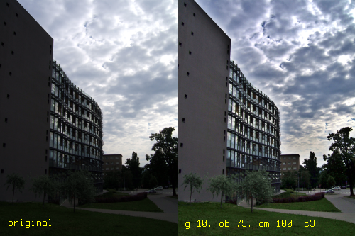
The first set of pictures is simply a preview. The image on the left is the original image, and the image on the right is processed by Advanced Tone Mapping with Gaussian-blur set to 10, opacity of blurred layer equal 75, opacity of merged layer full 100, and finally three copies of the merged layer (note the way I use to show those values – it is also used for naming the layers, which can be handy if you later forget which layer is which or what you have done). The image on the right might be a bit over the top, but it shows nicely what can be done with Advanced Tone Mapping script:
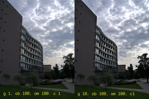
The next example shows some pretty conservative tone mapping. The one on the left was created with almost none blur, while the one on the right has 10% blur. Note the difference: the one on the left has no halo but appears a bit flat, while the one on the right has a slight halo but also has higher level of detail.
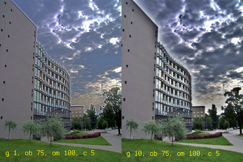
Oh my… the following example shows what can go wrong with tone mapping (I’m sorry for all the people who already gouged their eyes out). The reason why image on the left appears so flat and awful is that almost no blur was applied. The image on the right is a comparison with healthy blur applied. Five copies is still a bit too much, but hey, at least it has kind of action-like look.
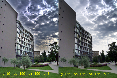
The last image shows the difference between the default blur and maximum blur available. As you can see in the right side picture, the halo is so huge it’s almost impossible to see. The bad news is that with maximum blur we lose a lot of detail near the borders of light/dark areas.
Ok, that’s it – now go and experiment with my script on your own photos. 8-)
PS: Underexpose your images – the dark areas can still be lightened, while the burned out areas are usually completely white and can’t be darkened.
PPS: The more contrast there is, the more layers you apply, the more blur you will usually need.
PPPS: Any kind of noise in your picture will be greatly amplified.
PPPPS: No, this is not HDR, this is just tone mapping of a single image (just jpeg, in my case). Tone mapping is a part of HDR, but HDR is not a part of tone mapping. ;)
3 thoughts on “Tone Mapping with GIMP”
dhubhe 2008-06-19
Hello, Congratulations, it is a very useful script!! Regards :-D
Dynamac 2008-08-10
I love your sense of humor, your very detailed blog, and your script
many thanks :lol:
abhilash 2009-07-04
This script is exactly what I was looking for. Thanks a lot!
Add your comment — How does this work?